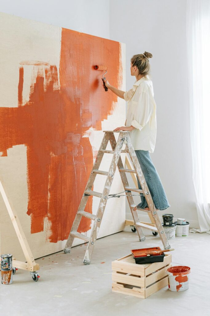
Colors are more than just decorative elements; they have psychological effects that can alter emotions, productivity, and even stress levels. Whether you’re painting your home or office, understanding color psychology ensures you create an environment that aligns with your desired ambiance.
Warm vs. Cool Colors: Their Psychological Impact
Paint colors are categorized into warm and cool tones, each with distinct psychological effects.
Warm Colors: Energy and Enthusiasm
- Red – Stimulates excitement and energy. Ideal for dining rooms or areas where social interaction is encouraged. However, excessive red may increase feelings of stress or aggression.
- Orange – Evokes enthusiasm and warmth. A great choice for exercise rooms or creative spaces.
- Yellow – Associated with happiness and optimism. Works well in kitchens and living areas but should be used in moderation to avoid overwhelming the senses.
Cool Colors: Calm and Relaxation
- Blue – Promotes tranquility and focus, making it perfect for bedrooms and home offices.
- Green – Symbolizes nature and balance. Best suited for bedrooms and relaxation areas as it creates a refreshing and peaceful atmosphere.
- Purple – Represents creativity and luxury. Lighter shades like lavender can have a soothing effect, while darker purples add sophistication.
To achieve the right balance, painting contractors in Westport, CT, can help select the best warm or cool tones for your home’s specific needs.
Choosing Colors for Different Spaces
1. Bedrooms: Serenity and Comfort
Soft blues, greens, and lavenders encourage relaxation and restful sleep. Neutral shades like beige or light gray also promote a calming environment.
2. Living Rooms: Warmth and Socialization
Earthy tones, warm neutrals, or soft yellows create an inviting space. If you want a bold look, deep blues or greens can add elegance while maintaining coziness.
3. Home Offices: Productivity and Focus
Blues and greens enhance concentration and reduce stress. If you prefer an energizing space, incorporate accents of yellow or orange.
4. Kitchens: Warmth and Appetite Stimulation
Warm colors like red, orange, or soft yellows encourage sociability and appetite. If you prefer a modern touch, muted greens or grays create a sleek, sophisticated look.
5. Bathrooms: Relaxation and Cleanliness
Cool colors like light blues, seafoam green, or soft neutrals create a spa-like atmosphere. White remains a timeless choice for a crisp, clean look.
Impact of Lighting on Color Perception
Lighting significantly affects how paint colors appear. Natural light brings out true colors, while artificial lighting can alter their appearance. Before finalizing a shade, test paint samples in different lighting conditions. Painting contractors in Westport, CT, can provide expert advice on how lighting influences color perception.
Tips for Choosing the Right Paint Color
- Consider the Mood You Want to Create – Think about how you want to feel in the space and select colors accordingly.
- Test Before Committing – Use sample swatches on different walls to observe how they look throughout the day.
- Balance Bold and Neutral Tones – If using vibrant colors, balance them with neutral accents to avoid overwhelming the space.
- Work with Professionals – Painting contractors in Westport, CT, can guide you in selecting high-quality paints that align with your vision.
Enhance Your Home with Westport Professional House Painters
Selecting the right paint color is crucial in shaping the atmosphere of your home. To ensure a flawless finish and expert advice, trust Westport Professional House Painters. Their skilled team understands the psychology behind paint colors and can help you create the perfect ambiance.
Contact them today for a consultation and transform your home with expertly applied, mood-enhancing hues.
Westport Professional House Painters
74 Church Ln Unit 3, Westport, CT 06880, United States
Phone Number: +14752449056
https://housepainter-westhartfordct.com/housepainter-westport